Responsive Full-Screen Gallery with Image Focal Point
The aim is to have a full-screen gallery that works both on desktop as well as mobile devices. The main issue is that mobile devices are often held in a portrait orientation, while desktop devices are landscape.
See the live demo of this recipe in action!
A quick brainstorm reveals that:
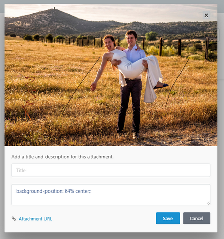
- Some landscape images work both on desktop and mobile, however, on mobile we wish to shift them to either side because the image focal point is not in the center. Here is an example:
This image looks fine on a desktop/laptop screen, but we only wish to show the area in the red square on mobile devices.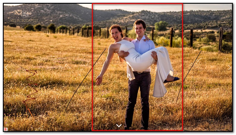
- Vertical images only look good on a mobile, so we don't wish to show them on a desktop at all, while some horizontal images only look good on the desktop (or mobile devices being held horizontally).
To achieve the above two aims, we can make use of "Description is Style" and "Media Query" properties of the Swiper Gallery component.
Step 1: Upload your photos
Log into your backend and go to Galleries → New Gallery
Upload your photos and make sure to save your gallery!
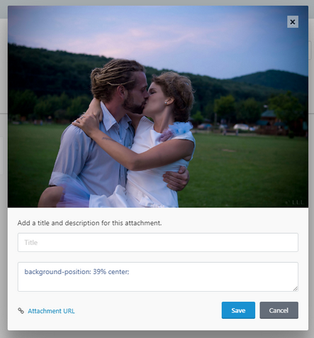
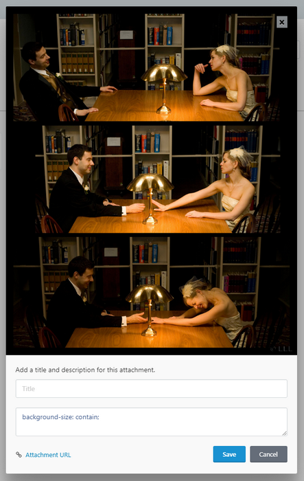
For each photo, add custom CSS that will only apply for small devices that are being held in a vertical position. Particularly, use the background-position rule to shift the image left or right. You can also play around with the background-size (set it to contain or cover). Some examples:
Step 2: Drop the swiper gallery to your page
Drop the component onto your page and check "Description is Style":
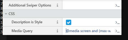
Also set "Media Query" to @media screen and (max-width: 766px) and (orientation: portrait) - this will ensure that the CSS that you include in your image descriptions is only applied to mobile devices in a portrait orientation.
You can also put your swiper inside of a div and set some styles to make sure that the images are displayed full screen, so your final page looks like:
{% put styles %}
<style>
	body {
    	background-color: black;
    	margin: 0;
    	padding: 0;
    }
	#home-gallery {
		height: 100vh;
		width: 100%;
	}
	#home-gallery .swiper-slide {
		text-align: center;
		font-size: 18px;
		background: #000;
	}
	#home-gallery .swiper-slide {
		background-size: cover;
		background-position: center center;
		background-repeat: no-repeat;
	}
	@media screen and (min-width: 766px) and (orientation: landscape) {
		#home-gallery .swiper-slide-vertical {
			background-size: contain;
			background-position: center center;
			background-repeat: no-repeat;
		}
	}
	@media screen and (orientation: portrait) {
		.android #home-gallery {
			height: calc(100vh - 56px) !important;
		}
		.android #home-gallery .swiper-button-next,
		.android #home-gallery .swiper-button-prev {
			display: none;
		}
	}
</style>
{% endput %}

<div id="home-gallery">
    {% component 'swiperGallery' %}
</div>
You might have noticed that in the above CSS we make use of the Orientation CSS media feature. You can read more about that on mozilla.org. We also have a rule for swiper-slide-vertical: this is a class that is added to all vertical images.
We also have some rules that are specific to android devices. For that to work, you must add Matthew Hudson's excellent "current device" script to your layout:
<!-- Mobile detection -->
<script src="https://cdn.jsdelivr.net/npm/current-device@0.8.2/umd/current-device.min.js"></script>
Step 3: Hide vertical images on horizontal screens
For this we will revert to some javascript! Add the following to your page:
 {% put scripts %}
    <script>
        $(document).ready(function($) {
            if(window.innerHeight < window.innerWidth) {
                var mySwiper = document.querySelector('#home-gallery .swiper-container').swiper;
                if (typeof(mySwiper) != 'undefined' && mySwiper != null) {
                    var slidesToRemove = [];
                    var slides = mySwiper.slides;
                    for (var i = 0, l = slides.length; i < l; i++) {
                      if (slides[i].classList.contains('swiper-slide-vertical')) {
                          slidesToRemove.push(i);
                      }
                    }
                    if (slidesToRemove.length > 0) {
                        mySwiper.removeSlide(slidesToRemove);
                        mySwiper.update();
                    }
                }
            }
        });
      </script>
    {% endput %}
What are we doing here? We loop through all of the slides in the swiper, and if any of them are vertical, we remove them from swiper. Read the Swiper docs for more information on swiper's API.
No Comments